I’ve been a dedicated Omnifocus user for about three years, and I’m a big fan of the 2.0 releases on all three platforms (Mac, iPhone, iPad). With the recent 2.0 update on iPad, we saw a move towards the styling of the iPhone Forecast Perspective. There’s one quirk about it that’s making me crazy, though. Pay attention to Due count on each day, and which days are highlighted.
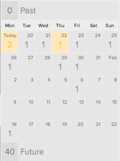
On the Mac, we can see a whole month. Today (Monday the 19th) and Thursday (the 22nd) are highlighted because there are available tasks that are due on those days:

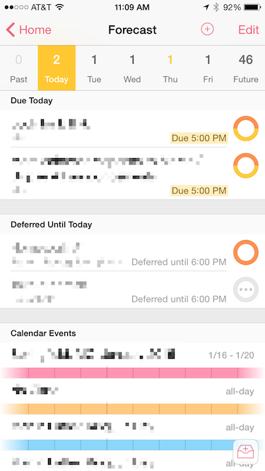
On the iPhone, the same days are highlighted:

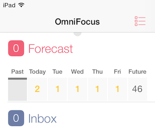
But on the iPad, all of the days are highlighted, whether or not the tasks are available (in this case, they’re blocked by their Start Dates):

This affordance on the Mac and iPhone has become a key part of how I use Omnifocus - days that aren’t highlighted mean I don’t need to look at them urgently. Days that are highlighted require attention.
In Ken Case’s plan for 2015, he wrote:
It’s time to make OmniFocus for iPhone just as capable as OmniFocus for iPad is, bringing over all those features like Review mode and the ability to build custom perspectives.
I do hope that before they port the iPad implementation over to the iPhone they’re able to incorporate this design detail back into the iPad.
Update January 20, 2015:
Ken Case responded:
@jeffvautin We agree! The universal update will adopt the Mac/iPhone handling of unavailable due soon tasks in Forecast.
— Ken Case (@kcase) January 20, 2015